Yesterday (Saturday June 24th) morning、A mikoshi came out from the shrine across from the atelier.、I went around the small town。The harbinger of a light car carrying taiko drummers、After a quick trip early in the morning、Young people carry the burden with great vigor.。I feel like I'm hearing this year's shout for the first time.、That's what I thought、Maybe the faces of the people carrying it are different.。Tradition is good too、Something is changing little by little、I think that's a good thing too。
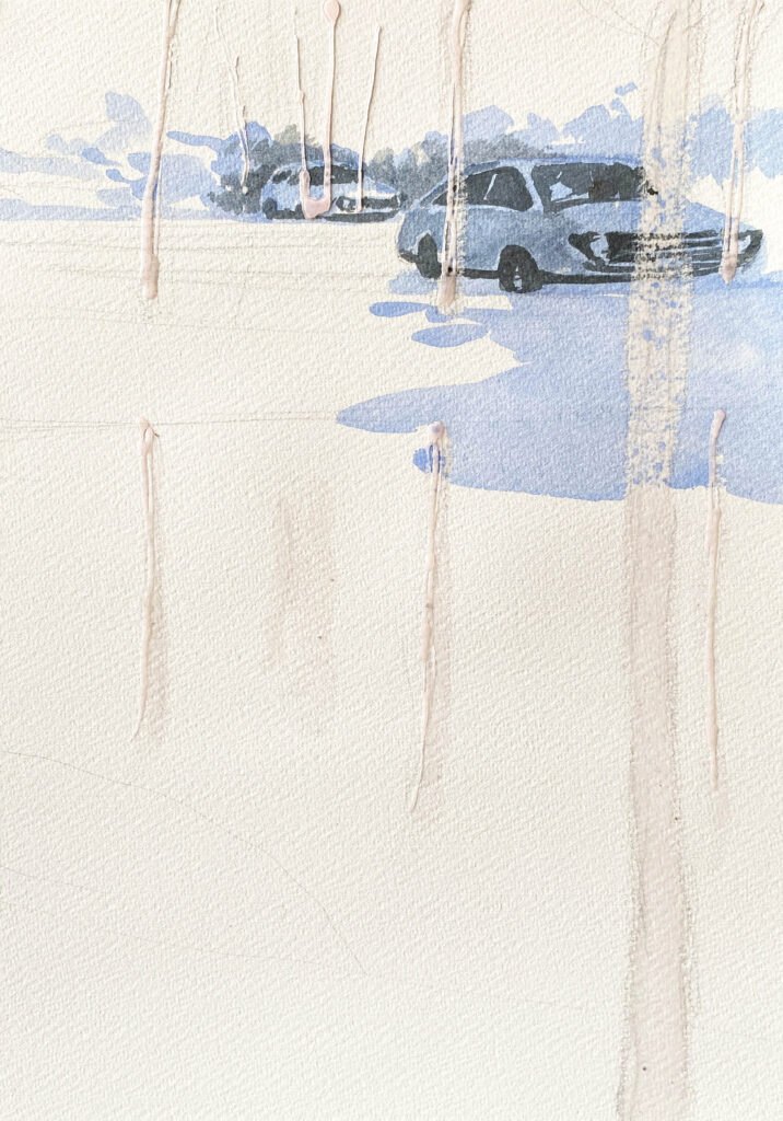
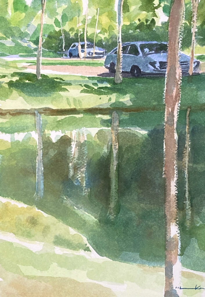
This is an arrangement of "Landscape with a parking lot"。A little ingenuity in how to wear masking、I tried rubbing some parts with a brush.。The effect is slightly visible。
The colors may be a little dull because it's made from 100% cotton paper.、It seems like it's partly because I've caught a cold.。"I have a cold" means、"Paper is weathered = it has deteriorated due to exposure to moisture"、This is a word often used by people who paint watercolors.。It's not even an old sketchbook.、I was careful about where I placed it.。
Whether the paper has a cold or not、Before you draw it, you can't really tell by looking at it.。But、The moment you put down your brush? ? I feel that、After applying the paint、It will be clearly visible to everyone。Even if I try to return it、Tear the individual packaging of the sketchbook、draw a sketch、Because I left the color behind.、Can't do that anymore? Because I have given up、I have never complained to the manufacturer (sales company).。But、This is originally a quality control issue on the part of the manufacturer or retailer.、It's not the writer's mistake.、I think it should be improved in a way that makes sense.。Writers disliked him for “catching a cold”、Two global manufacturers have gone bankrupt.,There seem to be 3。
I got off topic.。What I wanted to draw in this picture was a car.。It's not about attachment to a particular car model.、He wanted to incorporate "the current car society" into the landscape.。Nowadays, the global environment is becoming more and more severe every year.。It is said that CO2 emitters such as cars may eventually disappear.、I thought I'd draw it from a somewhat documentary perspective.。I don't think cars will disappear for a while yet.。
The theme of the painting is the atmosphere of "early summer".。The car is just a sight。I think it would be nice if you could feel the refreshing breeze in the painting.。