Draw a landscape with a felt-tip pen

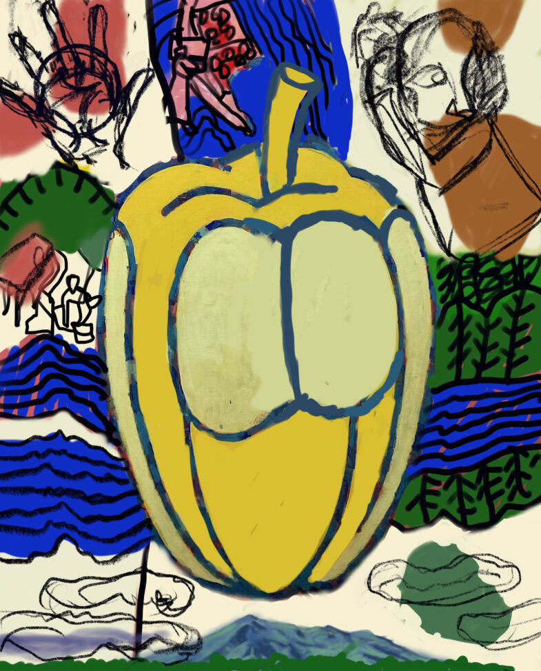
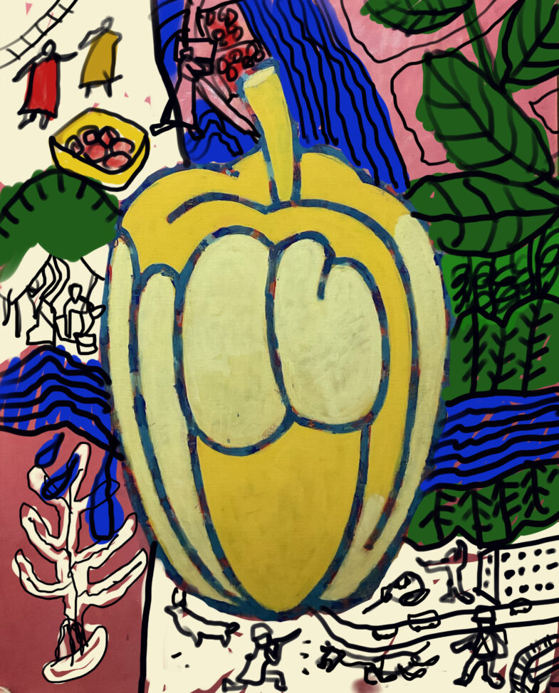
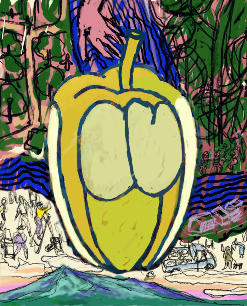
I drew a river in my hometown。This is a scene from 3 years ago because I couldn't go for a while due to Corona.。I was planning to go home this year, but my back pain got worse.、Unfortunately it was canceled at the last minute。Even though I had gotten a ticket...。Because of that,。

Try making a video、I am painfully aware that I cannot convey even a tenth of what I am thinking in my head.。Trying to give a somewhat convincing explanation、There's no end to it no matter how far I go。When I look at the video I made, it seems unsatisfactory.、Even if they were able to come up with something convincing, no one other than the person himself would see such a video.。

for me、Video production may be a good way to prevent blurring at the moment.。But、Not just drawing pictures、photograph、recording、Editing on a computer、Narration and its composition、Uploading to YouTube is very stressful every time.、It is possible that it may be accelerating the blurring.。anyway、Even though I'm spending a huge amount of time that doesn't even make a penny.、It's strange to me that I do it so desperately.。

Untitled (how many times)

I don't feel well for some reason。It's hot、It hurts everywhere、I don't know if all of that will come together.、Even now that I'm at the computer, my neck feels heavy.。

This is the only good part of the above S-key.。I feel like I just want to be blown away by the wind and fly somewhere--even though it's in a bad shape.。It's a mediocre idea/expression though.、To that extent, it has become a symbol.、You can use "mood" like the post office mark (whether that's a good thing or not)。

About S-Keith (for the umpteenth time)

S-kiss 1

S-Keith 2

S-Keith 1 is S-Keith from around January this year.。S-Keith 2 today (8/12)。At a glance、1Isn't it definitely better? In S-Keith 1, the relationships between the motifs are still quite different.。For the time being、I feel like I just have to draw it.。

Regarding 2, I have a pretty good idea.、The pictures are descriptive and not interesting at all.。

Comparing the use of space、1seems to be much more visually reasonable.。After all, a picture is something you see with your eyes.。From the logical connection of the depicted content (motif)、The thickness of the line、color contrast、The difference in the power of such visual elements。

I have at least two ideas、For the first time, E-skies starts from there.。This is still at the level of an idea。be logical and、Balancing the effective use of modeling elements。Esquis is the one who fills that in.。