Today's demo production。Juxtaposing complementary colors is a very common technique in oil painting classes.、in watercolor、Especially when drawing faces etc., I tend to hesitate due to my senses.。What are complementary colors?、When mixed together, it becomes gray.、Because of the color combination。
In watercolor paintings that use a lot of color bleeding,、The intention of "juxtaposition" was mixed up due to "bleeding".、There is a high possibility that it will turn gray。That's there、You have to be careful when using watercolors where you want to bring out the colors beautifully.。
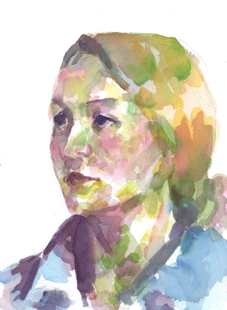
very ordinary、In the sketchy sense of watercolor、The color green is rarely used on people's faces in this way.。If it's a Japanese face、vermilion、crimson rake、Magenta、Warm colors such as yellow-o、Cerulean blue as a shade color、I should probably reuse about cobalt blue.。
While it becomes gray when mixed、Complementary colors also mean ``a relationship in which colors complement each other.''。By juxtaposing green、Redness with more presence than red alone、blood color、You can also expect a rosy complexion.。There are both sides.。
But、In fact, apart from that, there is a ``painting-like'' effect.、I realized this again while making a demo today.。I wish this could be further refined so that everyone can use it.、I felt that。It is ``painting'' orientation as opposed to ``sketching''.。this way of thinking、Of course, how you feel is not limited to just your face.。Think about how to use it、I am thinking of using it to create higher-grade works.。