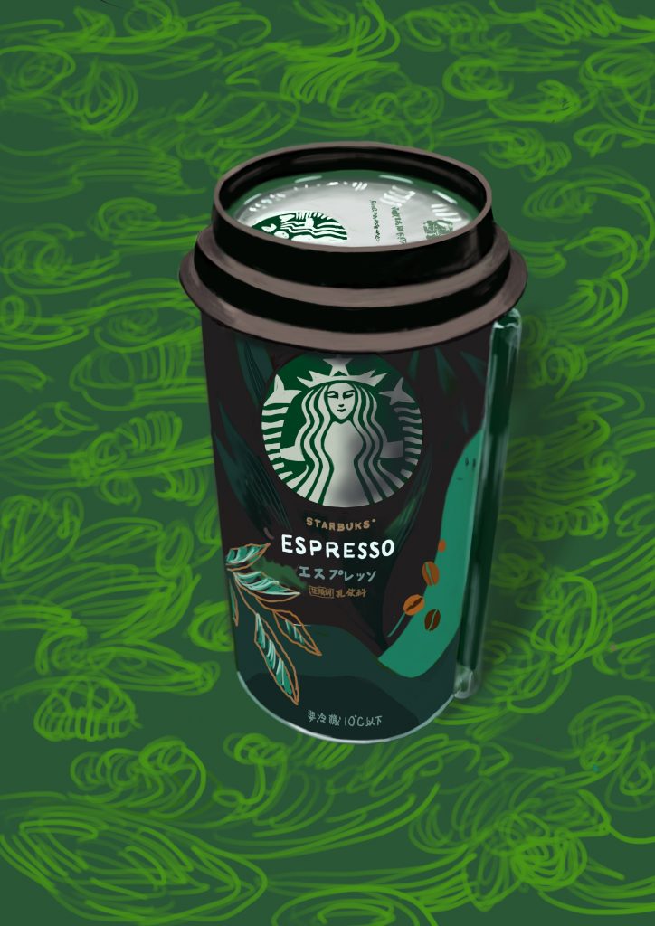
I drew Starbucks。I think it's a simple coloring suited for beginners、Something I bought as a sample for a classroom motif (although it had already been drunk by someone in our house)。
Looking closer、Even the dark areas can be divided into several stages.、Moreover, the difference in light and darkness is very small (slightly subtle)。I gave up because I didn't think everyone in the classroom could express this "with paint."。That may be the pride of this designer.。
Let's say you draw it with watercolor。Watercolor is an art material that can only be used in one-way light → dark.。Even if you can tell the colours、To achieve the brightness of the specified light、You will need to compare the balance and apply at least several times.。If you draw with a brush, there will always be some deviations (although it's good).。On top of that、To make it clear from a distance、If it's not huge、It's difficult to draw。Web Top and Real Materials (Paintings)、An example of a difference in the sense of existing materials such as paper.。
When I start drawing something like this, I feel、What makes designers so amazing。For me, who lived in the "supreme arts" category.、Perhaps there was a desire somewhere to unconsciously disregard design rather than "art."。Through recent sketches、I'm deeply regretting。