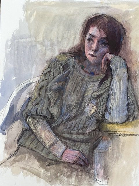
In "Watercolor + Pastel", the pastel tends to stand out due to the saturation.。Moreover, the uneven texture is eye-catching.。I want to express this painting based on watercolor.、I tried to limit the use of pastels as much as possible.。
in watercolor and pastel、Pastel has higher saturation in terms of composition.。That is, it is bright and easily noticeable.。So a combination of these two、Conspicuous place、It can be said that it is more effective to use pastels in bright areas (watercolors can be used in dark areas).、(will be in charge of a large area)。But be careful。Don't stand out too much。Moderation is important.。
10in a row for about a point、I understand that the expression is more eye-catching than watercolor alone.。But、I'm getting a little tired of it。Rather than watercolor + pastel、It seems like I'm getting tired of this descriptive method of expression.。Do you feel "enough is enough" written on the table surface or in the shadow?